Logging out of a web or mobile app is easy, right? You just click the Logout link.
Wrong.
When I recently changed mobile phone providers, I was suddenly faced with a whole new web interface for managing my account. Finding the Logout link proved to be difficult, which piqued my curiosity about how other sites handle this simplest of actions. A bit of research lead me to devise some tips for how to implement a best practice Logout link.
Get me out of here!
It all started when I logged into my new carrier's online portal for the first time. I updated my personal details and browsed the site for a few minutes, then decided to log out.
Except it wasn't obvious to me how I could do that.
It's 2013. We have mature web standards and well-defined design patterns. One might expect the design pattern for logging out to be the most well-established of conventions.
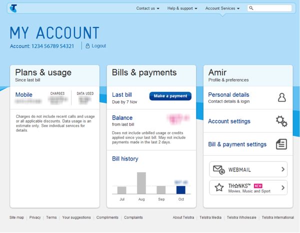
Maybe I was distracted, but it took me over 30 seconds to work out how to log out of my Telstra portal. See how long it takes you…
This experience inspired me to audit some popular websites with regard to their Logout functionality.
| Site | Label | Interaction | Position | Found Under |
|---|---|---|---|---|
| Sign Out | Hover | Top-right | Avatar | |
| Gmail | Sign Out | Click/touch | Top-right | Avatar |
| Hotmail | Sign Out | Click/touch | Top-right | Name and Avatar |
| Yahoo | Sign Out | Hover | Top-right | Avatar |
| Log Out | Click/touch | Top-right | Cog | |
| Sign Out | Click/touch | Top-right | Cog | |
| Yammer | Log Out | Click/touch | Top-right | Ellipsis ('…') |
| Dropbox | Sign Out | Click/touch | Top-right | Name |
| Log Out | Click/touch | Top-right | Name and Pin | |
| Amazon | Sign Out | Hover | Top-right | Name and account tab |
| Ebay | Sign Out | Hover | Top-left | Name |
| Telstra | Log Out | Click/touch | Left, below page title | Standalone link |
It’s amazing how many variations there are.
Don’t force me to remember—let me recognise!
I don't mean to pick on Telstra—who would have thought there were so many ways to log out of a website? However, here's the thing: I visit the Telstra website once a month to pay my bill, so my recall of functionality on the website is poor. I continually look in the top right corner to log out, which is a convention that many websites follow. When I don’t find it, I try looking on the left side, but still at the very top. Telstra fails to accommodate my preference on both counts.

Telstra hides the Logout link beneath the page title just left of the centre.
I conducted some research into why so many websites position the Logout link in the top right corner, and why more recently the link has been placed in a dropdown menu.
In the first GUIs, the Close icon was positioned in the top right corner of its windows. It's possible that the Logout functionality has become synonymous with “closing” a web session, although OS X positions the Close icon in the top left of its windows.
As for why the feature is hidden inside a menu by some websites, I believe this is an attempt to intentionally make the feature more difficult to find, forcing the user to simply close their browser but still remain logged into the service. This passive logged-in state can potentially provide the website with a means to monitor your web usage—data that can be collected and sold to advertisers.
Best practice tip: think about how often a person will visit your website. If your website is not visited frequently, then you should conform to a more commonly used standard—this currently happens to be in the top right hand corner.
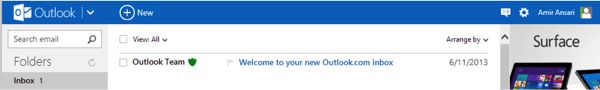
The Logout functionality in Outlook/Hotmail lives in the top right corner.
I can’t hover on a touch device
I'm amazed at how many sites I visit that rely upon the hover state to display core functionality. A user on a touch interface cannot hover with their finger, so if your Logout link lives in a dropdown menu that is triggered by the hover state, those users won't be able to access it, because touching the menu item often loads the user's profile page or account settings.
It's possible that the owners of these websites have failed to realise that today more people access the Internet via a mobile device than via a laptop or desktop machine. There may also be the assumption that users on a mobile devices would want to prefer a mobile-optimised version of the site, so the site’s designers haven’t bothered making their main site touch-friendly.
My own experience has taught me that there are many users who crave the full functionality of a main site, and will resort to finding ways to access that site via their touch devices. It would appear that Hover states are on the way out…
Best practice tip: ensure that your website caters for touch-devices and that core functionality is accessible via touch (and not hover).
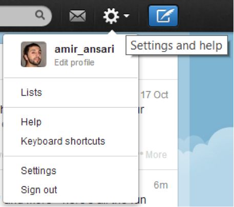
Twitter uses on-click
Eeny, Meeny, Miny, Moe … what do I click?
There are so many icons, avatars, links and buttons in the top right corner of a website that it’s often not clear which one will reveal the magical Logout link. I regularly find myself having to guess where the link is hidden.
Facebook uses a cog; Yammer uses an ellipsis (‘…’); Gmail uses the user's avatar; on Amazon, the link lives in a dropdown menu on the fourth tab from the right.
Avatars and usernames are similar in that they represent the user. When a user logs out of a web app, they're exiting their account or service, so I can understand why grouping the Logout link with information that represents the user would make sense. Grouping Logout with the user has certainly evolved into a common convention.
An image of a cog commonly depicts the configuration settings for an app (the icon likely originated from the world of watchmakers). Using a small icon has the added advantage that it takes up very little screen real estate. However, if someone is looking to configure a web service, isn't it more likely that they're more likely to customise or personalise their service, not stop using it? For me, it just doesn’t make sense to hide a Logout link under such an icon.
As for Yammer and their ellipsis, I suspect they simply wanted to be different. There are no visual cues for the user to deduce that this is where the Logout feature resides. The user is forced to discover it by exploring.
Best practice tip: Use an obvious and consistent approach where a username or avatar is used to hold the Logout link. Ensure it is clear that the icon, button or feature will display a menu.
Logging what we've learned
The lyrics to Sting’s famous song are: “If you love somebody, set them free.” They're not: “If you love somebody, make it difficult for them to leave.” So, the next time you embark on designing a Logout link, consider the following:
- Recognition is better than recall: the less frequently a user visits a website, the more you should conform to existing patterns and conventions.
- Think touch devices: there is no hover state on touch devices; if you're displaying a dropdown, do so after a click/tap instead.
- Keep the options simple and clear: if your app makes use of multiple icons or contains multiple menu items, consider grouping the Logout link under the user’s name (or their avatar) rather than an icon that may be confusing to some users.
Further reading
- The Designing Social Interfaces Sign Out pattern
- Five UX antipatterns to avoid when designing Log-in & Registration areas by Harry Brignull
- Login pattern on welie.com